III · THE WORK · ART HISTORY
Mondrian's Composition with Red, Blue and Yellow
▶ Listen · narrated
What looks like a diagram of pure geometry was arrived at by trial: months of moving tape, adjusting, looking, moving it again. The final arrangement was not designed in one stroke.
At a glance
- Artist
- Piet Mondrian
- Date
- 1930
- Medium
- Oil on canvas
- Dimensions
- 45 cm height
- Movement
- Neoplasticism, De Stijl
- Collection
- Kunsthaus Zürich
Look closer
Black lines of deliberately unequal weight
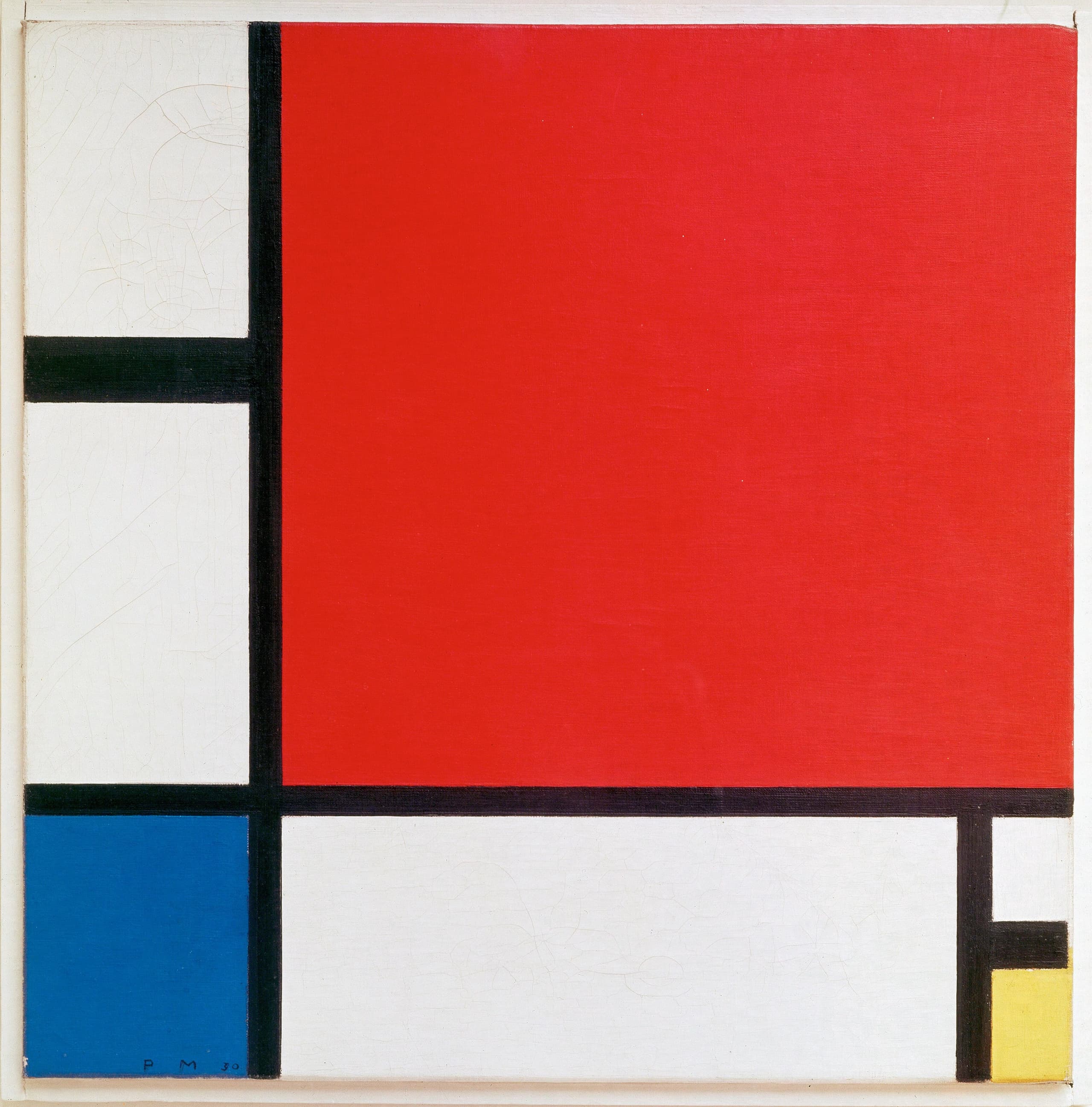
The black lines are not the same thickness. The vertical running down the left is wider than the horizontal near the upper edge. The thinnest line is the short vertical at the right edge. Mondrian varied the width deliberately, adjusting the weight of each line in relation to the colour blocks it bounds. A thicker line can hold a larger area of colour in balance; a thinner one lets white breathe. The differences are small but they are structural: if all the lines were the same width, the composition would feel mechanical rather than resolved.
The red block pushed into the corner
A block of red sits in the lower right corner, reaching both the bottom and right edges of the canvas. The blue and yellow are both held away from the frame by white and black. Mondrian pushed the red to the corner, where it anchors the composition without dominating it. The block is small in area but intense in hue, and its position at the edge means it pulls the eye outward rather than inward. The painting has no centre, and the red is part of why: it asserts that the edges matter as much as the middle.
Whites mixed to slightly different values
The white is not uniform. Mondrian mixed several whites, each with a slightly different warmth or coolness, and used them in different areas of the canvas. The differences are subtle — you might not notice them in reproduction — but in the original they give the white sections a faint variation in tone. This matters because white is not empty space here: it is a colour block like red or blue. White covers a large portion of the canvas. The variation keeps the white from reading as blank or negative. It is painted, not left.
The story
Mondrian made this painting in 1930, working in oil on canvas. It is 45 centimetres high. The picture is now in the Kunsthaus Zürich, where it has the inventory number 1200-1899.
The composition is made of black lines crossing at right angles, dividing the canvas into rectangles of white, red, blue and yellow. The lines are not all the same thickness. The colour blocks are not arranged symmetrically, and much of the canvas is white. The red, blue and yellow are pushed toward the edges rather than clustered in the centre.
Mondrian belonged to a movement called neoplasticism, and to the group De Stijl. Both terms refer to an approach that restricted painting to straight lines, right angles, and a small set of colours: the three primaries plus black, white and sometimes grey. The aim was to strip away everything particular — no curves, no diagonals, no reference to objects in the world — and arrive at a visual language that was universal rather than personal. Whether that language was universal is disputed, but the method was rigorous.
The painting was not designed in one stroke. Mondrian worked by taping strips of coloured paper to the canvas and moving them around for weeks or months, adjusting the position of each line and the size of each block until the composition felt resolved. Only then did he commit to paint. The process was slow and iterative, and the finished picture is the record of that looking and adjusting, not a diagram drawn from a plan.
The whites are not the same white. Mondrian mixed several versions, each with a slightly different tone, and used them in different areas of the canvas. The variation is subtle, but it means the white is not empty space: it is painted surface, as much a colour block as the red or blue. White covers a large portion of the canvas, and the faint differences in tone keep it from reading as negative or leftover.
The red block sits in the lower right corner, touching both the bottom and right edges of the canvas. The blue and yellow are both held away from the frame by white and black. The placement is deliberate: the red anchors the composition without sitting in the centre, and its position at the edge pulls the eye outward. The painting has no focal point in the middle. The structure is distributed across the surface, and the edges matter as much as the interior.
The black lines vary in width. The vertical on the left is wider than the horizontal near the upper edge; the short vertical at the right edge is thinner. Mondrian adjusted the weight of each line in relation to the colour blocks it bounds. A thicker line can hold a larger area in balance; a thinner one lets the white breathe. The differences are small, but they are what keep the painting from feeling mechanical. The grid is not neutral: it is tuned.
Why it mattered then
In 1930, abstraction was not new, but the question of what abstraction was for — what it could mean, and whether it needed to mean anything — was still open. Mondrian's position was that painting could be reduced to a set of universal elements, and that those elements, properly arranged, would express something fundamental rather than personal. The restriction to straight lines, right angles and primary colours was not a style choice but a philosophical one: it was an attempt to make a visual language that was not tied to any particular culture, time or individual. Whether that universality was achievable is another question, and one that was argued about then and since. But the ambition shaped the work. Mondrian was not trying to make something beautiful in a conventional sense, or to represent an emotion, or to refer to the world outside the canvas. He was trying to make something that was visually resolved and structurally clear, and that needed no reference beyond itself. The painting was meant to be looked at as a thing, not as a picture of something else. The method — moving tape for months before painting — was part of that discipline. It meant the composition was arrived at by looking and adjusting, not by intuition or gesture. The slowness was deliberate. The result was a painting that looks simple but is not: the balance of the lines and blocks is precise, and small changes in weight or position would unsettle it.
Why it matters now
The painting is still looked at because the questions it raises have not been settled. Can a visual language be universal, or is that a category mistake? Is a painting that refers to nothing outside itself more honest, or just more limited? Does reducing the means — fewer colours, no curves, no representation — make the result clearer, or does it just narrow what can be said? Those questions are not rhetorical. Different viewers answer them differently, and the painting does not resolve the argument. What it does do is make the argument visible. The composition is clear enough that you can see what Mondrian was trying to do, and decide for yourself whether it works. The painting also matters as a record of a method. The fact that it took months of moving tape to arrive at something that looks this simple is itself interesting. It suggests that what looks like pure geometry is actually the result of a long process of looking and adjusting — that the clarity is achieved, not automatic. The painting is not a diagram. It is the trace of many decisions, most of them small, all of them deliberate. And it has influenced a great deal of design since, not always in ways Mondrian would have recognised. The grid, the primary colours, the asymmetry — all of those have been borrowed, adapted, flattened into branding and layout. Whether that is a validation of the universal language idea or a dilution of it is another question the painting does not answer.
The surprising detail
Mondrian worked by taping coloured paper strips to the canvas and moving them around for months before committing to paint. The process was not quick, and the finished composition was not the result of a single decision or a sketch. He would adjust the position of a line by a few millimetres, step back, look, adjust again. The tape let him try arrangements without fixing them, and the months of looking meant the final painting was the record of a long process of refinement. What looks like a diagram was arrived at by trial, and the clarity is the result of that looking, not the starting point.
Remember this
The composition that looks like pure geometry took months of moving tape to resolve. The whites are not the same white, and the black lines are not the same width.
Test yourself
Why does varying the thickness of the black lines matter, when the painting is supposed to be about universal elements rather than personal adjustments?
Because even a system of universal elements has to be arranged, and the arrangement is where the decisions happen. If all the lines were the same width, the composition would be mechanical: the grid would be neutral, and the colour blocks would sit in it without relation to one another. By varying the line weight — making one vertical thicker, one horizontal thinner — Mondrian tuned the structure so that each line holds its adjacent colour block in balance. A thicker line can anchor a larger area; a thinner one lets white breathe. The variation is what makes the grid feel resolved rather than arbitrary. The universal elements are the vocabulary, but the painting is still a sentence, and the sentence has to be built. The thickness of the lines is part of that building.
Go deeper
- Composition with Red, Blue and Yellow · Wikipedia
- Composition II in Red, Blue, and Yellow — Wikidata · Wikidata
Image: Piet Mondrian, Public domain. Licence: Public domain. Source.